Timothy Brittain-Catlin admires two sensitive, sumptuous new additions to Westminster Abbey: the Weston Tower by Ptolemy Dean and triforium galleries by MUMA


Ptolemy Dean, Surveyor of the Fabric of Westminster Abbey, has designed a fine new tower on the site of some unmissed lavatories, just outside Poets’ Corner between the Chapter House and the eastern front of the south transept. This tower contains a lift shaft which is clad from its base in bands of the various stones used over the centuries for the building or repair of the abbey itself; a gentle oak staircase wraps around it, and the whole construction is clad in an ornamental glazed frame on a star-shaped plan formed by two rotated, overlaid squares.
It is decorated with leaf patterns, which Dean says originated in Matthew Digby Wyatt’s screens at Paddington Station, and leadwork in chevron patterns is intended to evoke the octagon of Ely Cathedral. This is tucked into a courtyard that is open-ended towards the east; standing here you can see precisely how the style of the Palace of Westminster opposite was intended to complement the abbey’s Henry VII Chapel – something often said but rarely experienced.


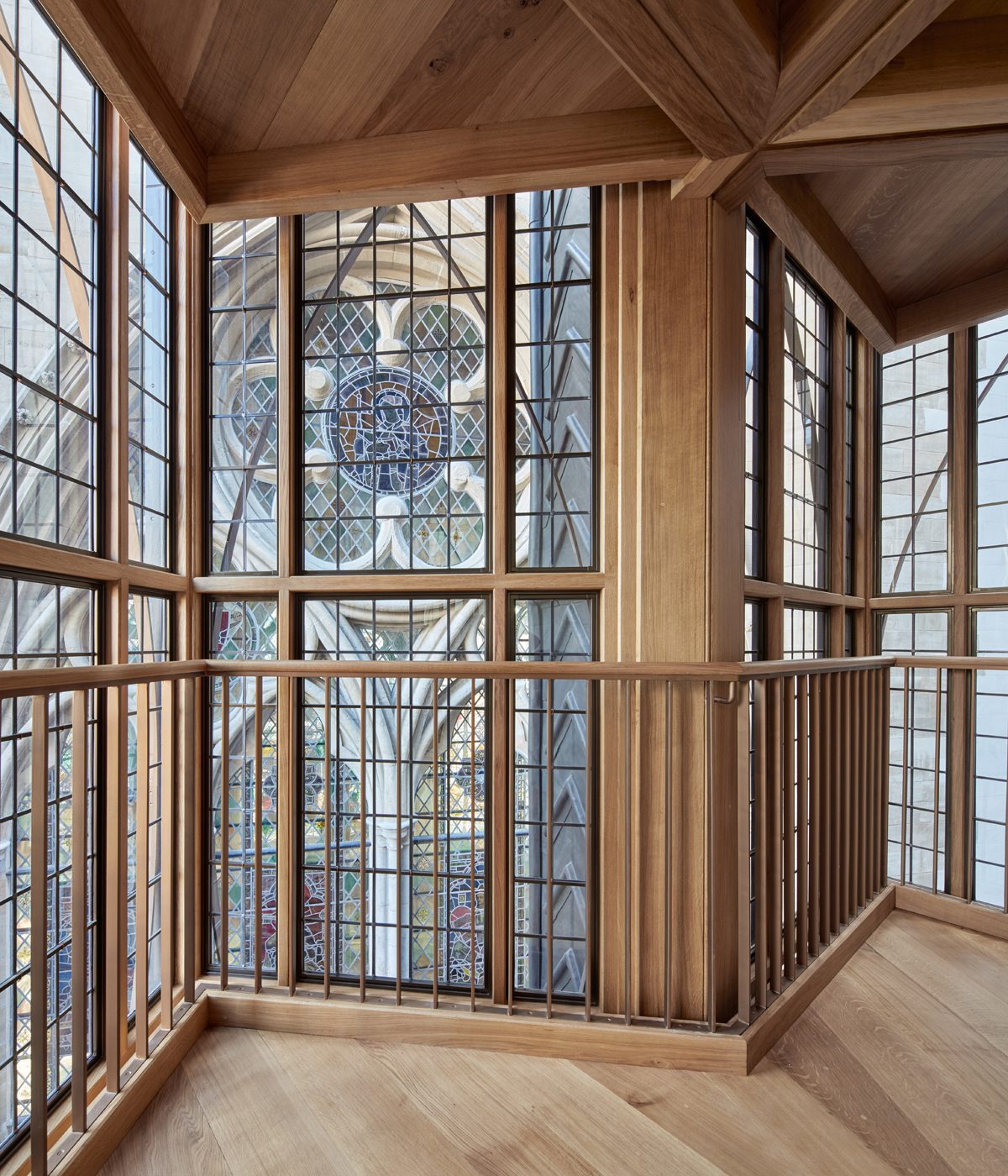
The tower, substantially financed by and named after the Weston family, takes visitors 16 metres up to the level of the floor of the triforium of the abbey and, after passing through a glittering lobby and a rare piece of penetrable old wall, into new galleries above the vaults over the eastern part of the main body of the church.

From Poet’s Corner, within the abbey, a doorway leads to a new lobby at the base of the Weston Tower, where Ptolemy Dean has exposed pieces of the church’s giant stone raft foundation, and displayed a stone coffin unearthed during works. An oak stair winds around a concrete lift core clad in bands representing all 17 types of stone used in the abbey’s construction, in chronological order from base to top. They include Purbeck Marble (1000AD), Magnesian Limestone (1400AD), and Portland Whitbed tooled in the same manner as Hawksmoor’s additions to the abbey. Ascending the 108 steps affords new close-up views of the abbey’s fabric. From the tower, access to the galleries is via an internal bridge whose windows are decorated with fragments of thirteenth-century stained glass found beneath the triforium floor.
These galleries, designed by McInnes Usher McKnight Architects (MUMA) under Stuart McKnight, are of stupendously high quality. The space occupies the upper parts of the eastern side of the two transepts, plus an irregular quatrefoil shape that links them over and beyond the high altar below. Sculpted corbels high up in these spaces suggest that they were originally intended to be chapels, reached by monks through one of the very narrow spiral staircases embedded in the fabric at either end. The geometry of the plan, the external walls with those strange soft-sided triangular windows that the abbey has, and the views down into the sanctuary along the internal sides would make this a memorable space in any case. Great diagonal members of Wren’s oak roof structure slide down to the floor. But, fitted out with the abbey’s treasures, which include dressed funeral effigies, plaster maquettes for sculpture, Wren’s model spire and Hawksmoor’s drawings, it feels like being in a mediaeval forest, the sun and the shadows both close by and glimpsed at a distance across one of the many angles of the rooms.

MUMA won this commission following the success of its Mediaeval & Renaissance Gallery at the Victoria & Albert Museum, itself a tribute to the museum’s policy of entrusting architects with the design of permanent displays, and young ones at that. McKnight says that the theme from the start was the relationship between the natural light and the artefacts within. Many objects are housed in cabinets, built by Glasbau Hahn, that sit on plinths faced in Purbeck Marble or, in the case of the funeral effigies, in black granite.
The heights of these were calculated so that sunbeams would reach a point about 100mm below the glass upper part of the cabinet. In a project like this – which includes a thirteenth-century retable that has had a difficult life – the whole skill is to manipulate the light without damaging the exhibits. Thus they are placed in ways that both protect them and highlight them. In two areas where the plan is shallow, huge leather curtains provide shelter from the sun.

“The exhibition layout is structured by the inherent architectural zones, the opportunities for views and sightlines and the pattern of light levels”, says MUMA. “Within this structure, the collection is grouped in accordance with the four curatorial themes, with the exact locations of the 300 objects defined by the architecture and/or interrelationships between artefacts”
The plinths and other display fittings, such as tall, narrow patinated steel columns, are extremely heavy – the effigies, for example, glide out for conservation on runners, creating massive cantilevers; they are supported within Wren’s floor thanks to the fabulously tactful work of engineer The Morton Partnership. Every visible junction is beautifully designed; within the cabinets the objects sit on plates that hover over other plates that sit themselves just above the stone top of the plinth. The fact that this display is as fascinating as, say, the replica Crown Jewels within is a tribute to all the designers involved.

The feeling up here is reminiscent of the Burrell Collection – perhaps not surprising since McKnight points out his own Glasgow origins. And Ptolemy Dean’s tower with its luscious Tudor geometries follows a pattern established by William Whitfield’s ‘Elizabethan’ Richmond House, the former Department of Health & Social Security in nearby Whitehall, of 1982-4. When I was a student, the great sculptor Henry Moore came to lunch and joined a discussion on why ‘all modern art was rubbish’. His view was that one could not even begin to tell whether something was any good or not for 30, 40, 50 years: then the overhyped would drop away and a real picture would emerge. It looks as if the transgressive architecture of the 1970s and 1980s is turning out to be the start of something wonderful.
Additional Images


Download Drawings
Credits
Architect (tower)
Ptolemy Dean
Architect/exhibition designer (galleries)
MUMA
Structural engineer
The Morton Partnership (building fabric), Price & Myers (tower), Michael Hadi Associates (exhibition design)
Services and daylight consultant
Max Fordham
Lighting consultant
DHA Design
QS, project manager
Gardiner & Theobald
Principal designer
Moran Architects
Fire consultant
Arup
Display cases
Glasbau Hahn
Stone plinths and metalwork
TP Aspinall & Sons (with Ian Knapper)
Stone supplier
WJ Haysom & Son
Seating and leather wall cladding
Benchmark Furniture
Leather curtains
Bill Amberg Studio
Leather supplier
Elmo Leather
Lights
Mike Stoane Lighting
UV window film
Sun-X
Blinds
Levolux