Steven Holl Architects strikes a sensitive balance between communality and privacy at the Barts Hospital Maggie’s Centre, finds Richard Hill


The latest Maggie’s Centre – the twenty-third of these extraordinary small buildings which provide free practical and social support for people with cancer and their families and friends – is at Barts Hospital in London, in the corner of the main quadrangle that was rebuilt to James Gibbs’ design between 1730 and 1768. In recent years Barts has seen almost continuous rebuilding and adaptation, and the process continues. The interiors of two of the intact Gibbs blocks have been stylishly adapted to new uses, and the facade of a third block is now the frontispiece to an impressive atrium which gives access to numerous specialist units.

The Maggie’s is a new building designed by New York City-based Steven Holl, attached to the fourth block, on the first floor of which is the splendid Great Hall. Taken as a whole the building campaigns demonstrate the varied ways in which a historic site can be changed for modern purposes.
In the early stages of the project there were some bad-tempered exchanges between the Friends of the Great Hall and SAVE, who together opposed the scheme, and the Maggie’s team. Michael Hopkins devised, and received planning permission for, a spoiler scheme on a nearby site. Maggie’s and the Barts Health NHS Trust pressed ahead with Holl’s design and I am glad they did, because the new building is splendid.

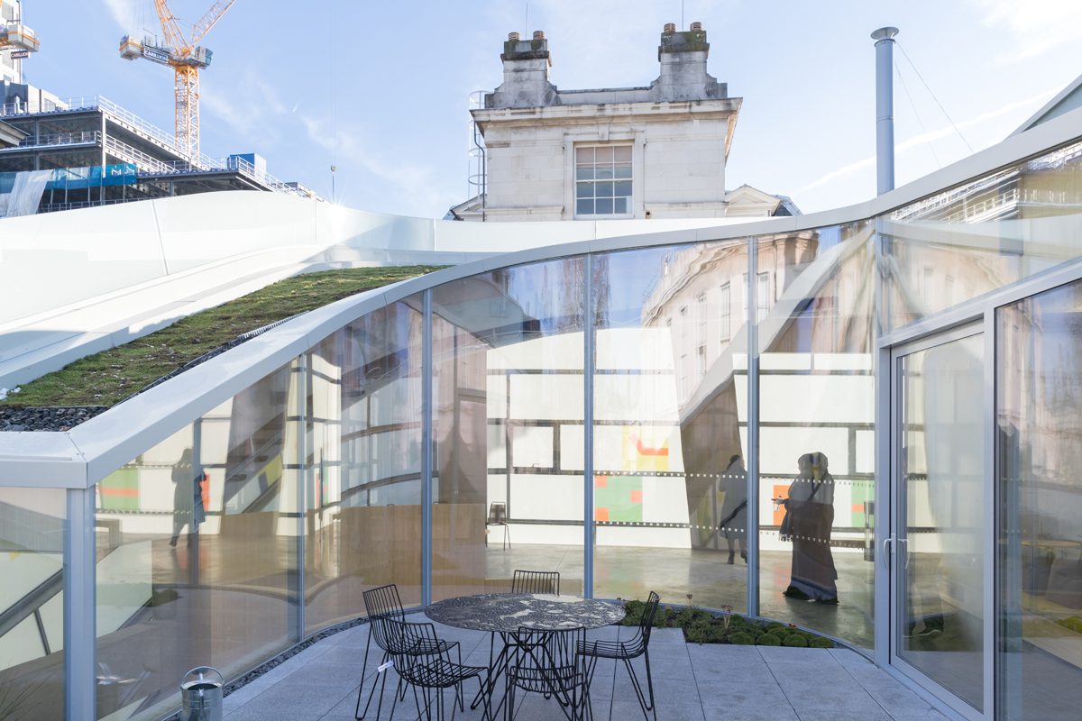
Most Maggie’s buildings are single-storey but here the constrained site required multiple storeys. The two upper floors look into a full-height inner space, with circulation spiralling around it.
Structure, staircases and floors are concrete, straightforwardly detailed, no fuss. The skin of the building, which expresses the snail/spiral idea, is its most striking feature. It is of Okalux, a sandwich of glass and translucent insulation with a middle layer of coloured motifs in places. The outer surface is etched, the inner polished as normal. The complexity of the sandwich means that numerous effects are possible.

Light comes into the building but privacy is maintained: an important point in this very tight location with people passing by on all sides. The softly etched outer surface, combined with the horizontal layering of the panels, creates an echo of the grey stone of the adjacent Gibbs building. But the range of secondary and fleeting visual effects is what justifies the effort that has gone into the facade.
I visited the building twice, the first time on a gloomy December afternoon: grey sky, grey Gibbs building, grey Holl building, all very moody and delightful in a Dickensian way. As dusk fell and the lights went on it became like a lantern, with fleeting shadows projected onto the glass from the inside. The next day was sunny and the facade was sharp and clear. But the interior was extraordinary: shafts of strong winter light were diffused through the facade in changing patterns. At one moment the cornice mouldings of the Gibbs building were projected in shadow onto the inside of the glass, creating a lesson in sciagraphy and architectural history for visitors.
Maggies’ Centres don’t provide cancer treatment, at least not in the normal sense of the word, but they do provide advice, support, information, stress management, art therapy, tai chi, yoga.
Along with this flexibility and openness of aim goes an apparently simple spatial programme – a general space with a big table and refreshments, spaces for small-scale group activities and for individual meetings. Over the years Maggie’s has gained experience in what works best, but each new building captures the individual insights and priorities of its architect.

Holl’s interior raises questions about shared and private space. The multi-storey arrangement is helpful: the top floor is a single activity space leading on to a terrace, with a degree of seclusion from the shared volume. The ground and first floors have three counselling rooms of various sizes, but they all have very high ceilings and one entire wall of diffused glass. These rooms, separated from the main space by enormous pivoting doors, are very elegant indeed. These are not the cosy confessional spaces – with a box of tissues on the table – with which we are familiar in most health buildings. You might talk about your anxieties in these rooms at the Maggie’s, but in doing so you would feel like someone important, glamorous even, not a victim. You might even feel that you were playing a role, and escape for a while from the pressure of your inner fears. That would be good.

My guess is that the Maggie’s staff would prefer that the pivoting doors stay open as much as possible, and that users and staff talk openly – if necessary out of earshot of others – in a companionable shared space. The interior of the building has a strong sense of safety and seclusion from the world so this should be possible. Privacy within a larger space is of course an aspect of the way that many of us live today, helped by our mobiles, laptops and earphones.
The closed doors and endless corridors of hospitals are resistant to this change, often for good and obvious reasons. But if hospitals are to treat the whole person,not just the body, much more fluid space is possible, desirable even, as Steven Holl’s design demonstrates.
Additional Images


Download Drawings
Credits
Architect
Steven Holl Architects
Associate architect
JM Architects
Structural, services engineer
Arup
Landscape architect
Darren Hawkes Landscapes
Quantity surveyor
Gardiner & Theobald


