AHMM’s mixed-use Westminster Bridge Road tower is not so much a citadel as a city sandwich, finds Glenn Howells

AHMM’s new building on Westminster Bridge Road, facing Parliament across the Thames, is home to over 1000 students but is not at all a typical student housing project. It is a complex mixed-use development that cleverly integrates a range of residential accommodation for students at London universities with a private sixth-form college and a public gymnasium. Within this mix is another level of complexity, with the college – DLD – taking 200 of the 1143 student bedrooms, and sophisticated access and safeguarding arrangements for its teenage students.

Above the podium base, the upper floors adopt a form that echoes Charles and Ray Eames’ turned walnut stool (1960). A south-east-facing break in the massing admits light to the podium-level courtyard.
The first thing that you notice about the building is its confidence, boldly delivering over 50,000 square metres by filling the site and permitted height limits. The building is neither shy in its massing nor its language, with the horizontal emphasis of its facade contrasting markedly with its neighbours.

Windows to the 15 floors of student accommodation are gathered in continuous linear strips of glazing that divide the facade into strata
As with all of AHMM’s work, the concept is clear and can be traced through from the organisation of plan and section to details of the facade and interior finishes.
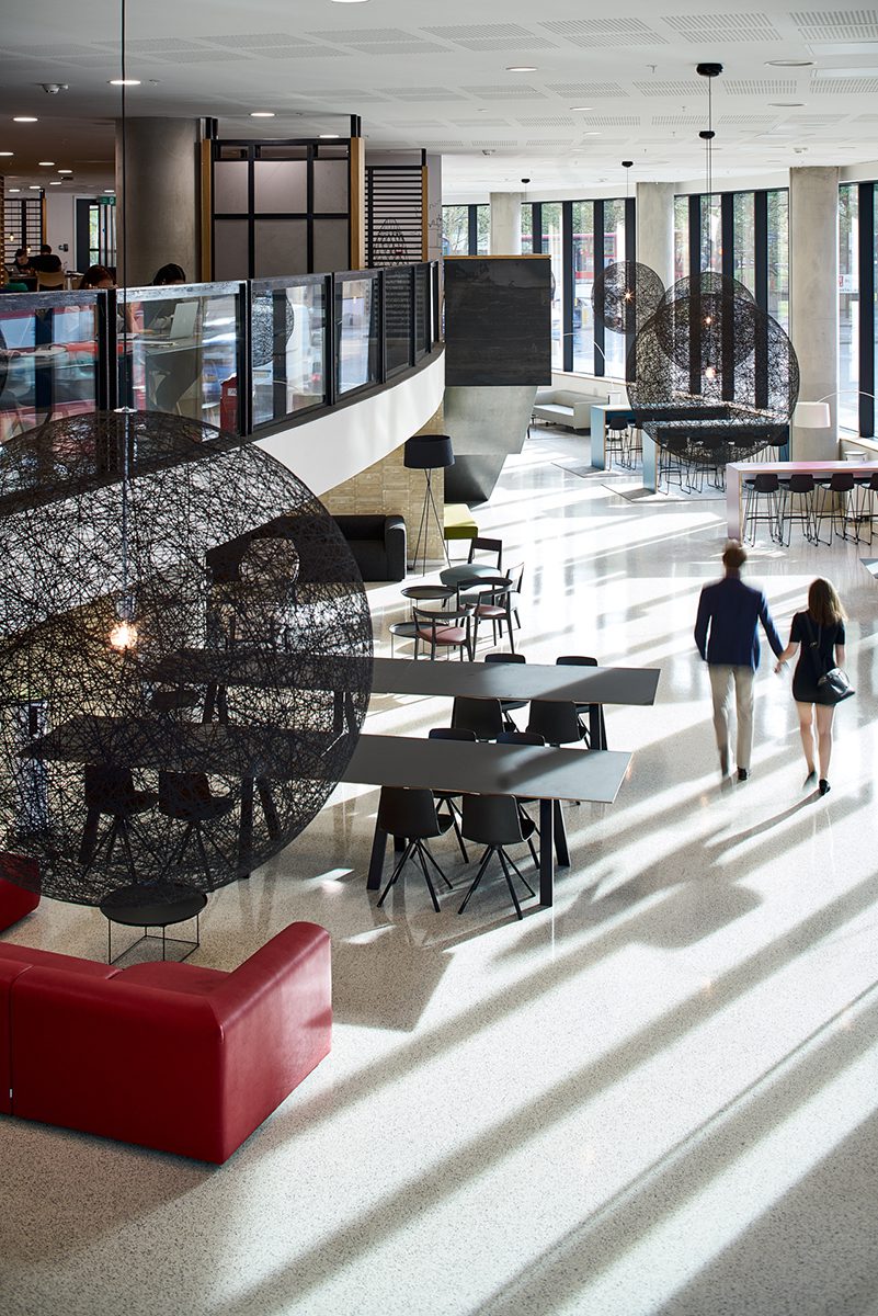
The C-shaped plan for the residential levels works well in resolving the bedroom clusters around two cores. The convex side of the form confidently faces north and creates the strong banded facade that can be seen from across Westminster Bridge. This form sits on a three-storey podium, tear-shaped in plan, that accommodates the entrance foyer, residents’ study areas, lettable workspace and the teaching spaces of DLD College.

The design also responds well to a site that sets up a number of difficult challenges. Despite changes to the highways and the recently completed adjacent hotel, the immediate context at ground level is a hostile place for pedestrians. AHMM has tried, and succeeded, in humanising this part of Lambeth by providing public entrances and a glazed active frontage to the pavement, where neighbouring buildings have consigned the ground floor to loading bays. AHMM has also sought to develop links with other buildings, such as St Thomas’ Hospital, opposite, through considering how best to join up the pedestrian crossings along Lambeth Palace Road, and thereby starting to address the imbalance between vehicles and people.

The space to the southern rear of the building, accessed from Upper Marsh, is presently used for cycle storage and a small pocket garden that is linked to the college cafe. It seems, however, that this space is ‘open-ended’ in that it has capacity to adapt to a wider ‘green route’ that is planned along the railway viaduct. This would indeed enhance the setting of the building whose form suggests that it should be surrounded by true public realm, but which does at present feel ‘fenced in’.
In terms of the longer views of the building, the key perspective is from Parliament Square looking south across Westminster Bridge. The facade is curved not only in plan but also in section, and the white skin subtly undulates. Like AHMM’s recent rippling glass building at 61 Oxford Street, this is boldly and unashamedly playful – something the practice would not perhaps have considered a few years ago. Personally I find that it works here as it softens the mass and scale and helps this brute of a building to nestle comfortably among its diverse neighbours.
The context is one that has a particular personal resonance for AHMM partner Simon Allford as (viewed from Parliament Square) the building peers over the shoulder of a St Thomas’ Hospital building designed in the 1960s by his father, David, as a partner at YRM. That building is characterised by absolute rigour, with not a single cut tile, and the contrast created by the newcomer is not accidental – the intention is to offer a counterpoint to YRM’s pure grid.

As one would expect from AHMM, the plan is clean and well judged, and the cores are optimally positioned and do not waste floor area that could be used for accommodation. Looking at the drawings in advance of my visit, I was concerned that the tight courtyard might compromise views, privacy and light levels, but discovered that my reservations were only partly justified.

The clever positioning of the cores means that most rooms enjoy views and adequate privacy. In terms of daylighting I remain unconvinced at the lower levels and think a lighter facade in the courtyard may have benefitted the bedrooms, but this would have compromised the composition and contrast between outer and inner skins that allows the form to read so successfully.
The palette of external materials is calm and works well with the geometry of the building. The doubly curved aluminium panelled skin works very well with the faceted glazing, thanks to the deeply modelled facade that creates the illusion that everything is curved, at a fraction of the cost.
“As with all of AHMM’s work, the concept is clear and can be traced through from the organisation of plan and section to details of the facade”
The inside is equally rigorous, from the arrangement of spaces to the monochrome palette of materials. The residential accommodation – bedrooms and shared living spaces – benefits from the decision to have continuous horizontal glazing that makes the most of a Thames view which extends from Nine Elms in the west to Tower Bridge in the east. This must be the best-appointed student address in the capital.
The horizontal glazing also has opening vents which add personal control and a connection to the outside that would be denied by a mechanical ventilation system specified purely for its energy efficiency.

Common areas are generous in scale and while the residential foyer is acoustically a little sharp at ground level, the mezzanine study areas are somewhat softer, with a greater use of oak acoustic panels.
There is considerable diversity in the student accommodation, with 10 different room types offered at a range of prices, but the best views at the top of the building (which squeezes in just 200mm below the maximum height permitted by protected views) are generously reserved for all residents, with common rooms and terraces located here.

It seems that the building has also been designed with longevity in mind: while it is presently divided into over 1000 cellular student rooms, the frame and indeed floor-to-ceiling heights do allow for redivision and a range of uses that should see the building remain for many years, irrespective of shifts in student numbers.
The best student housing projects by Arne Jacobsen, James Stirling or Louis Kahn all manage to rise above the logistics of organising cellular spaces to create a composition which has a strong design concept and character. The Westminster Bridge Road building achieves this, and also reflects the way that universities are increasingly integrated within the fabric of our cities rather than walled off and separated. While the building overcomes considerable constraints to provide a significant quantity of student residential accommodation, it has also been opened up to wider usage that prevents it becoming the usual student housing citadel.
Additional Images


Download Drawings
Credits
Architect
Allford Hall Monaghan Morris (AHMM)
Facade consultant
Arup
Structure, fire and acoustic consultant
Ramboll
Main contractor
Balfour Beatty
Client
Urbanest
Facade
Fill Metallbau
Steelwork
Bourne
Curtain walling
Schueco
Green roof
Bauder
Concrete floor
Lazenby
Lighting
Zumtobel


