Kengo Kuma’s skewed shells skilfully meet the requirements for new museums, but it’s time to rethink the brief, says Hana Loftus

A new museum, in current orthodoxy, has to fulfil two briefs. One is to be a powerful talisman of place, conjuring up visitors, increased investment, and a strengthened brand for its host city or town. This demands design that is distinctive – a trademark image – backed by a narrative that speaks to inspiration drawn from the location itself. The other brief is the functional one, which has also ossified into a template. A voluminous foyer with cafe; a large flexible hangar for touring temporary exhibitions which are designed to fit into similar spaces the world over; space for some form of permanent display; and the full checklist of education spaces, auditorium, offices and stores.
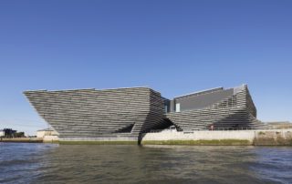
Kengo Kuma’s new museum on the Tay, the V&A Dundee, meets both of these briefs. Its dramatic, semi-nautical form is recognisable at a glance, and the craggy cladding of rough concrete ledges – inspired, he says, by the wind-eroded cliffs of Scotland – has a neat narrative that requires no effort to understand. Internally, it has a dramatic foyer with feature stair, coffee bar and wifi; large hangar-like temporary exhibition hall with all the necessary servicing; a restaurant with a view. The top-heavy building form – two conjoined inverted pyramids – also neatly solves that contemporary museum problem, where the area required for exhibitions – which the orthodoxy states must all be on a single floor level – is always greater than the space required for the back-of-house spaces that can fit either above or below them.
Folds in the shell-like concrete structure act to stiffen the building, whose roof extends up to 19.5 metres beyond its footprint. Arup’s original structural proposal included walls up to 600mm thick with huge pieces of steel embedded inside. By experimenting with the shape of the building in 3D models, the team cut the thickness of the walls by half and greatly reduced the reinforcement.
Seen on the Tayside quay, the museum is brooding, with almost no windows visible from the town side. The concrete bands are unapologetically brutal, satisfyingly dour on a steely grey day and rebarbative on a sunny one. Close up, the external expression holds strong. The ledges – functionally useless, a kind of extreme parametric rustication – are fixed over an impregnable concrete shell, 400mm thick in places, made to withstand the worst that the Tayside weather can throw at it for decades to come.
This structural concrete is refreshingly raw: pigmented black, at first glance it seems as though it is wrapped with tarpaper complete with taped joints, but in fact the texture is imprinted from the formwork into the concrete itself. Photographs of the project under construction reveal how this tough shell, like a blackened steel hull complete with welded joints, expressed the ship-like geometry of the building more clearly than the finished product, where the ledges blur and blunt the shape.
On its own, this hulk would already have been a radical, beautiful object. Kuma’s intent in over-cladding it was to soften the building, giving it an organic form – that cliff metaphor – but, indeed like a cliff, the result is anything but soft. The bracketry holding up the concrete strata is clearly on view; the cladding itself has an armour-like quality; and, while the industrial detailing is not to everyone’s liking, I appreciated its refusal to pretend that it is anything other than concrete bolted to concrete with plenty of marine-grade steel. This building is here to stay.
Inside, however, it all feels just a bit lazy. The big foyer is clad in oak slats that are as cosmetic, and as superficially photogenic as the external concrete ledges, but there is a tacky glass balustrade to the stair, a suspended panel ceiling lifted from a cheap airport, a jarring mesh-clad lift, and a poorly-finished plasterboard bulkhead where someone just couldn’t be bothered to think of a better idea. From the full-height first-floor windows, the consequences of adding the concrete fins to the building become painfully evident. Like the cliff strata that inspired them, the concrete ledges are a seagull paradise, but nature must be banished from taking hold so electric shock tape runs in several lines along each fin, connected by glaringly visible wiring. The ledges rise up to form a kind of staggered parapet around the terraces, but not one that meets building regs, so another glass balustrade is necessary. And glazing, concrete wall, concrete fins and brackets clash in multiple unfortunate junctions rather than a joyful bricolage.
The building resembles two inverted pyramids which are separate at ground floor level, and then twist to connect at the upper galleries floor. This creates an open archway through the centre of the museum, which frames a view of the River Tay.
The public may not mind, or even notice, the lack of ideas or the mundane details, but great buildings – and for £80m, this building should be held to the highest standards – should show attitude and imagination put to work on every corner.
Object display is no longer the raison d’être of a building like this, and the Scottish galleries, showing the permanent displays, are limited: this is not a place to lose yourself for hours, discovering jewel after jewel, but a carefully edited exhibition of Scotland’s finest design moments. At the launch, V&A director Tristram Hunt spoke of the 12,000 objects with a Scottish connection that his team tracked down in their collection: that only 300 are on display feels token. It will serve well for tourists and school groups, and ZMMA’s exhibition design bears the hallmark of the V&A’s immaculate approach, but it feels a little thin.
The centrepiece of these galleries, and the one artefact that should take the breath away, is Charles Rennie Mackintosh’s Oak Room. It is situated deep in the plan, exquisitely restored but neutered by its setting. Where windows would have been, there are instead undivided blank panes of frosted, dimly backlit glass. And devoid of furniture, the sensation of sitting at a window-side table, in an exquisite wooden cocoon above the cold brightness of the street, is almost unimaginable.
The stepped walls of the main hall are pierced by slot windows. A glass lift rises to the upper floor, from which visitors have views across the space. There is a picnic room on the mezzanine floor.
The project’s funders valued the talismanic image of this building enough to back it as the budget doubled, then quadrupled, to nearly £10,000 per square metre. Its functions could have been met with a fraction of the budget, but it is not enough, currently, for a museum to not also be a spectacle.
Yet between the new museum and the historic city centre, a new masterplan for the surrounding plots is being built out in the most banal and ugly form. The new train station – complete with budget Sleeperz hotel – is a hideous ‘gateway’ to the city complete with parabolic arched entrances cut into the cheap cladding, which are more McDonalds than triumphal. A hotel and apartment building under construction already dwarfs Kuma’s project and blocks the view from the historic town to the river, through the ‘arch’ formed by the museum itself. Kuma speaks of the museum as a ‘living room for the city’, but this bellyflop by Dundee’s planners and city authorities maroons this living room across two dual carriageways and in the middle of a sea of mediocrity. It speaks volumes about the priorities of Scotland’s public authorities, that the tenacity shown in supporting the high architecture of the museum is so absent when shaping the everyday experience of their citizens.
These wider failings are not Kuma’s fault, and his building is undeniably a success in the terms of its brief. Dundee’s visitor numbers will deservedly rocket – it’s a fun, youthful city and most of the townspeople I spoke to were excited about the boost the museum will bring. The partnership and outreach programmes that the V&A will offer, using the building as a hub, will have a significant impact. But as an experience, neither the building as an object, its contents, or its relationship with the city around it, offer a moment of genuine revelation to go with the plentiful Instagram moments. It has none of the power of David Chipperfield’s Hepworth Wakefield, the audacious spectacle of Frank Gehry’s Bilbao Guggenheim, or the elegant luxury of SANAA’s Louvre Lens, with its procession through 5000 years’ worth of treasures in a single, huge, immaculate hall.
One can’t escape the sense that there’s a hollowness at the heart of this project – something too calculating about the way it prioritises image over experience, gesture over detail, brand over content.
None of this will matter to the V&A, Dundee city council, or indeed the Scottish government who have invested so heavily in the project. They have a highly photogenic building and the column inches to put the city on the map; and the money is spent, so it’s futile to ask whether £80m was really needed to bring this about. The Bilbao Guggenheim rewrote the brief for new cultural buildings: a shift which the public has embraced and which Kengo Kuma has obediently but complacently fulfilled. But 20 years on, it’s time for a project that rewrites the brief again.
Additional Images
Download Drawings
Credits
Lead architect
Kengo Kuma & Associates
Delivery architect
PiM.studio Architects
Executive architect
James F Stephen Architects
Structural, civil, m&e, facade engineer
Arup
Landscape architect
Optimised Environments (OPEN)
Wayfinding and signage
Cartlidge Levene
Water feature specialist
Fountains Direct
Exhibition design
ZMMA
Client
Dundee City Council


